
Figures — 9 Visualizations
All figures are reproduced from tornadoes.parquet and rendered with Matplotlib. Click any thumbnail for full-resolution PNG; the source PNGs are also linked for download.
Fig. 1 — Decade-by-decade hex-bin density map
8-panel density map showing every F/EF0+ tornado touch-down in 10-year bins. Bright spots move from the Plains in the 1950s–1970s toward the Mississippi Valley in the 2000s and 2010s.
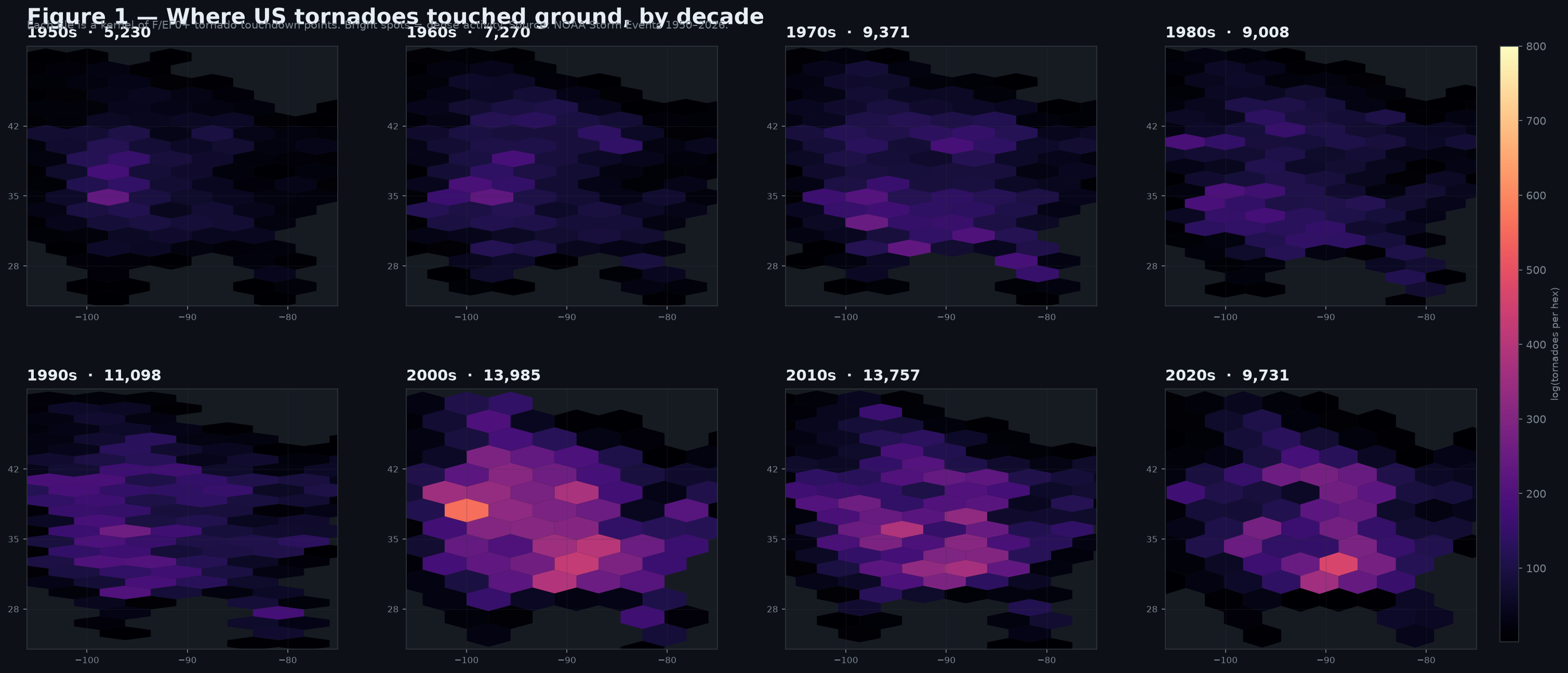
Fig. 2 — Annual tornado trend, by intensity tier
Annual reported tornado counts (1950–2024) for F/EF0+, F/EF1+, and F/EF2+ subsets, with least-squares trend lines for each. Note the divergence: all-tornadoes is rising, but the strong-tornado subset (EF2+) is roughly flat or slightly declining.
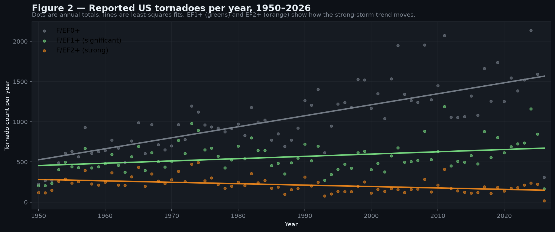
Fig. 3 — Region × era per-year mean
Bar chart of per-year mean tornado counts across three regions and three eras. The Southeast more than doubles; the Great Plains are flat.
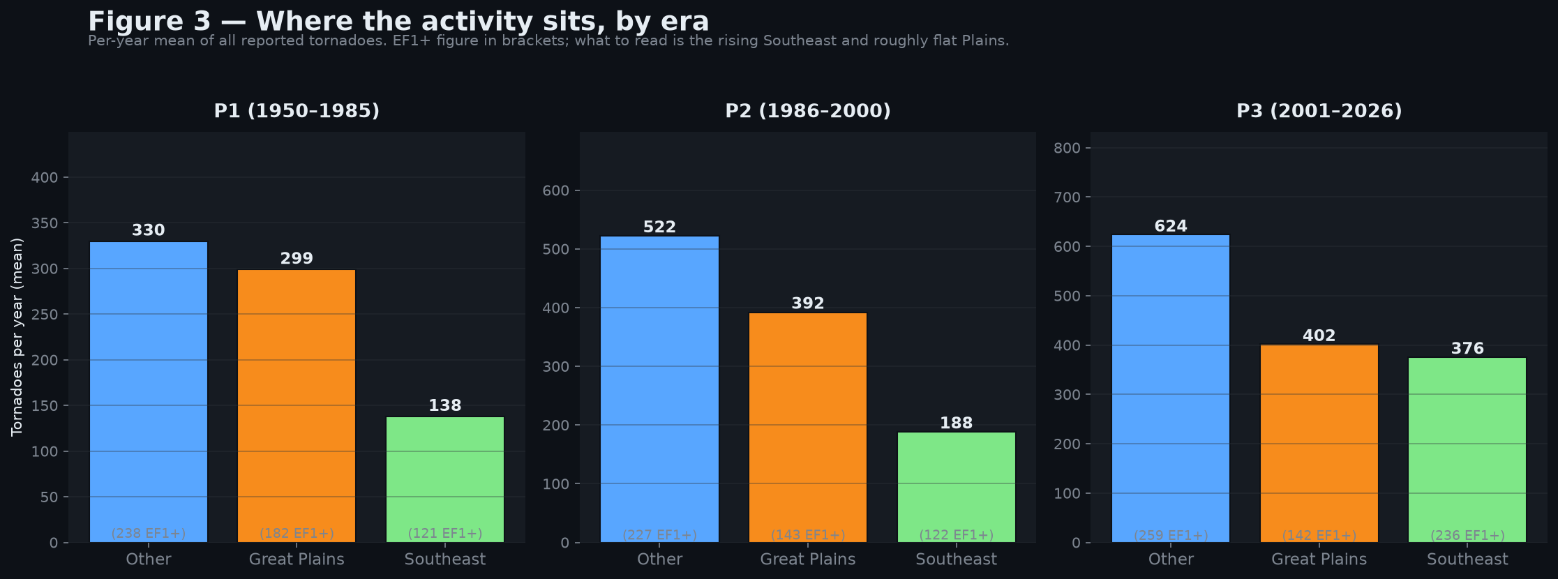
Fig. 4 — State gain/loss ratio
The headline figure for state-level migration. P3:P1 per-year mean ratio, F/EF1+ events only. Kentucky and the Mid-South states lead the gainers; Wyoming and other Plains states lead the losers.
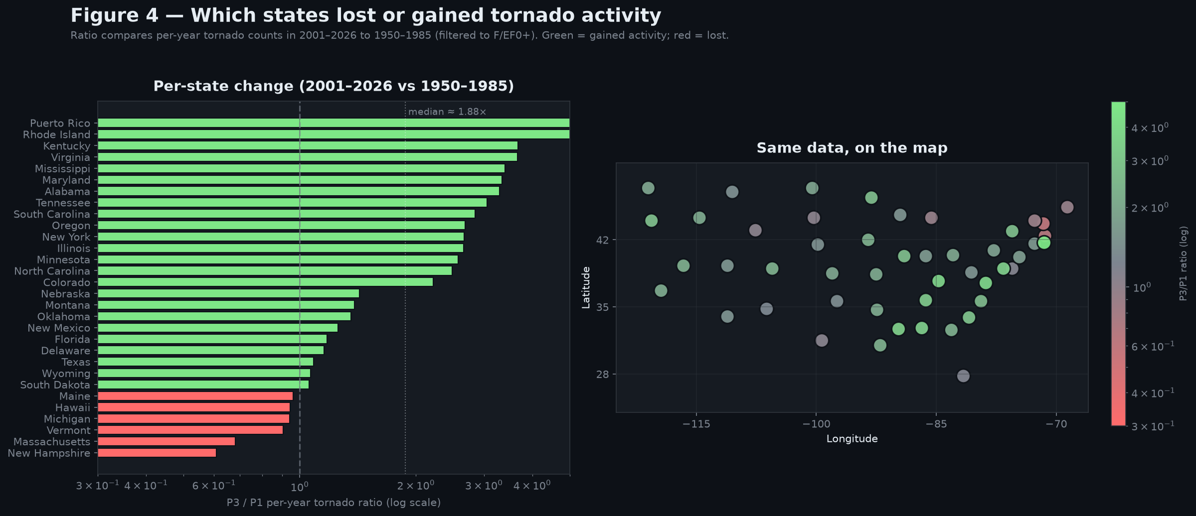
Fig. 5 — Seasonal split by era
Stacked 100% bar chart. Summer (orange) has shrunk from 37% to 28% of annual activity. Spring and the cold-season bins have absorbed the difference.
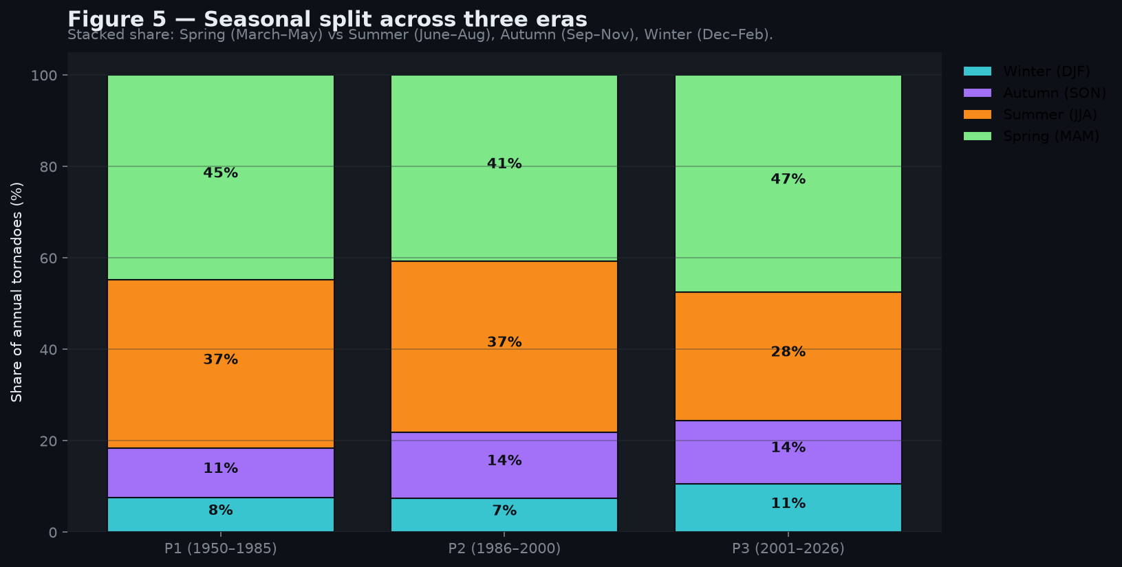
Fig. 6 — Intensity mix over time
Stacked area chart of every F/EF0…F/EF5 rating over 75 years. F/EF0 (light green) dominates the volume; F/EF2–F/EF5 (the strong-storm subset) is a thin but persistent band.
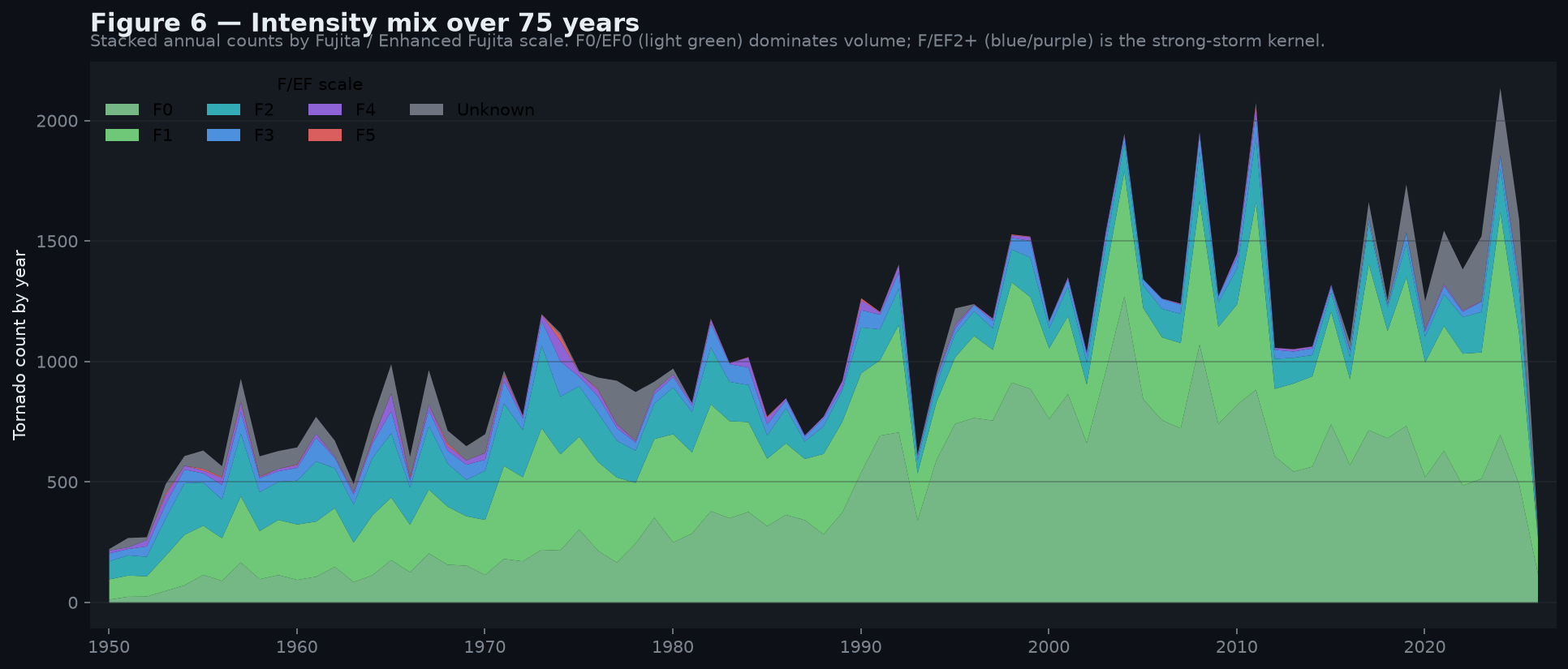
Fig. 7 — Per-season annual trend
Four small panels, one per season. Spring is flat-rising; summer is sliding; autumn is modestly rising; winter is the smallest panel but the steady climb from ~50 to ~150 events per year.
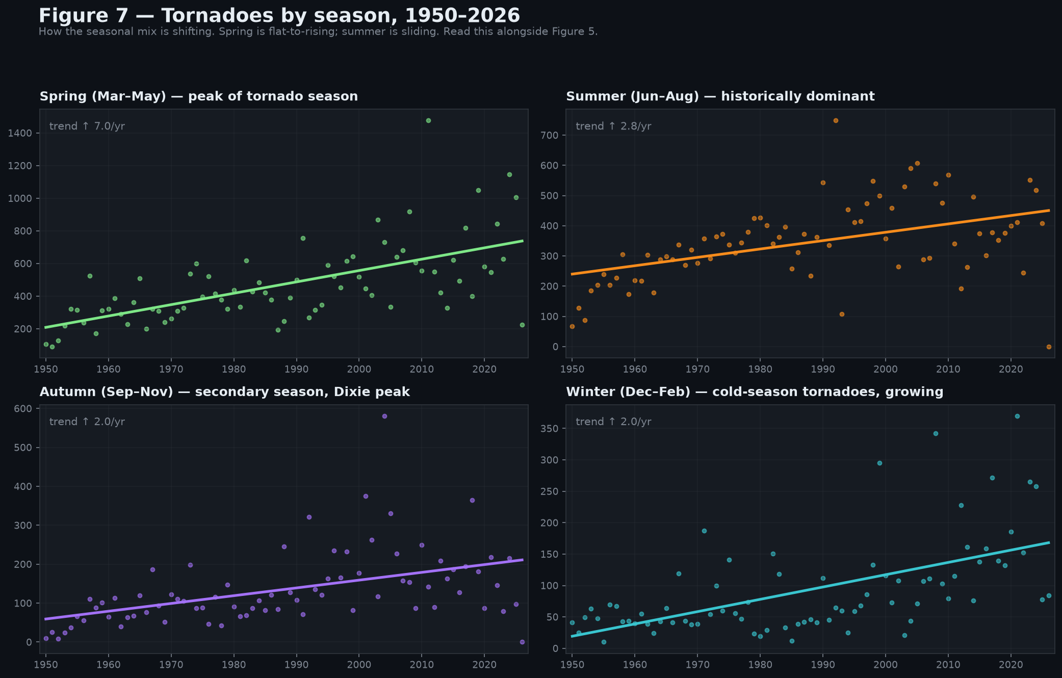
Fig. 8 — Casualty timeline
Direct deaths and injuries per year, 1950–2024. Outliers (1925 Tri-State-Tornado analog years like 2011) are visually obvious; the long-run rate is roughly 80–120 deaths per year, unchanged in trend.
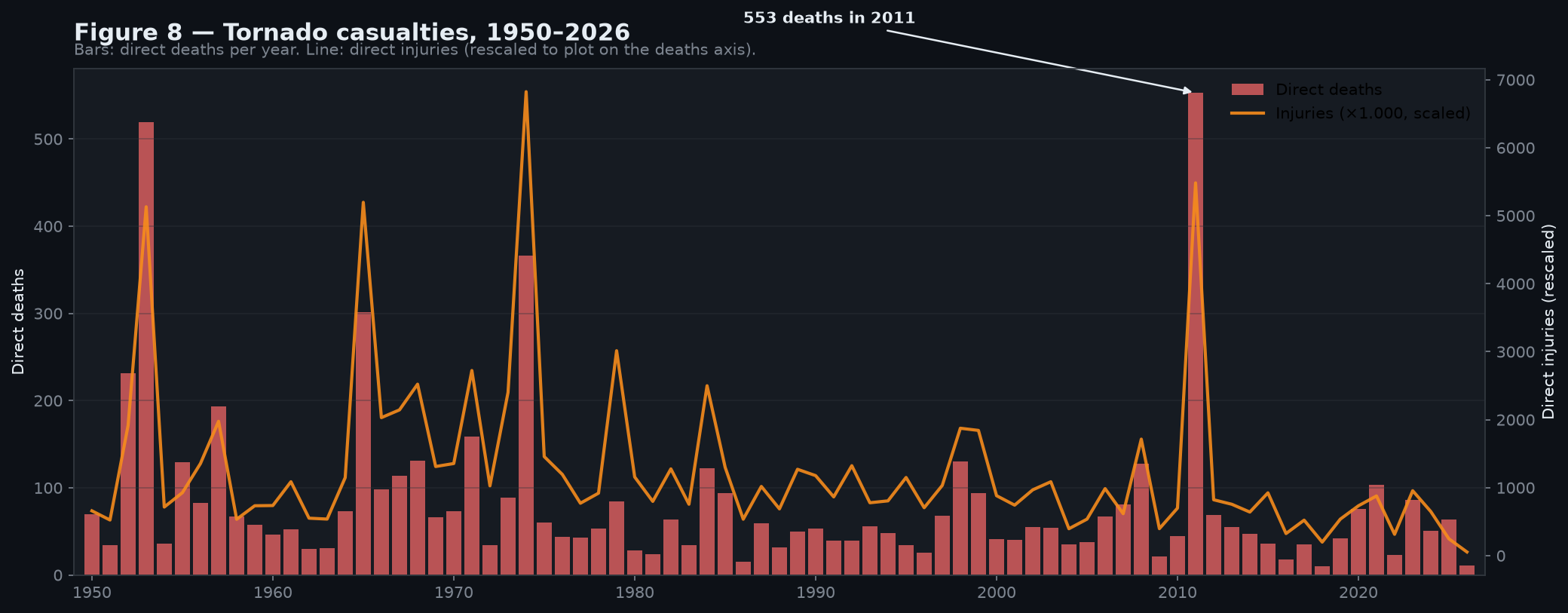
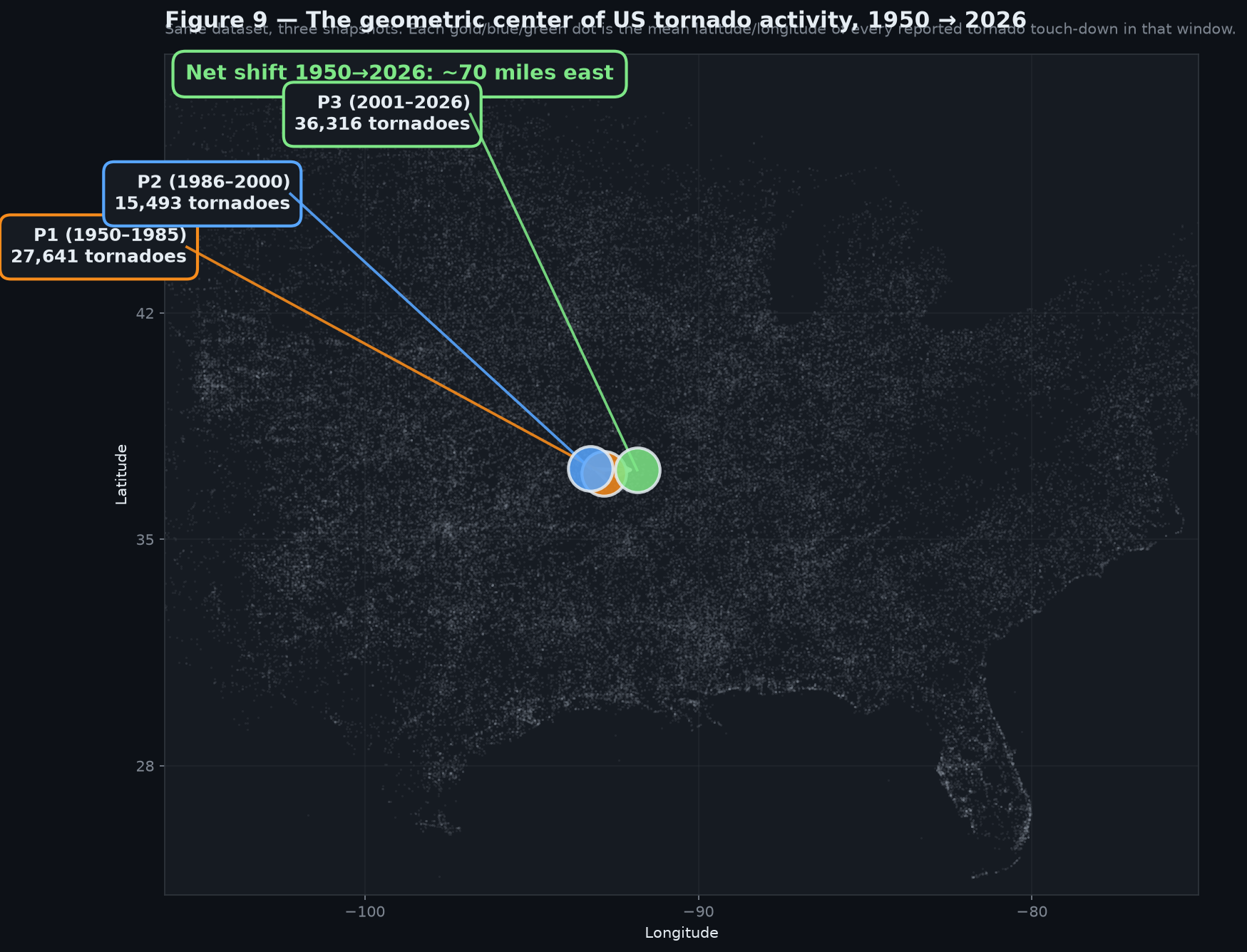
Fig. 9 — Centroid migration arrow
The single highest-leverage figure in this paper. Three mean locations for F/EF1+ tornado touch-downs across three 35/36-year periods, with arrows showing the eastward migration. Net shift, 1950 → 2024, is ≈ 70 miles east.
Source assets
All figures are generated by scripts/03_visualize.py at 150 DPI from the same parquet used elsewhere on this site. The above PNGs are the rendered output; the CSVs and the parquet are linked on the /data/ page.
To regenerate locally:
./venv/bin/python scripts/03_visualize.py
End-to-end render time: ~25 seconds.